


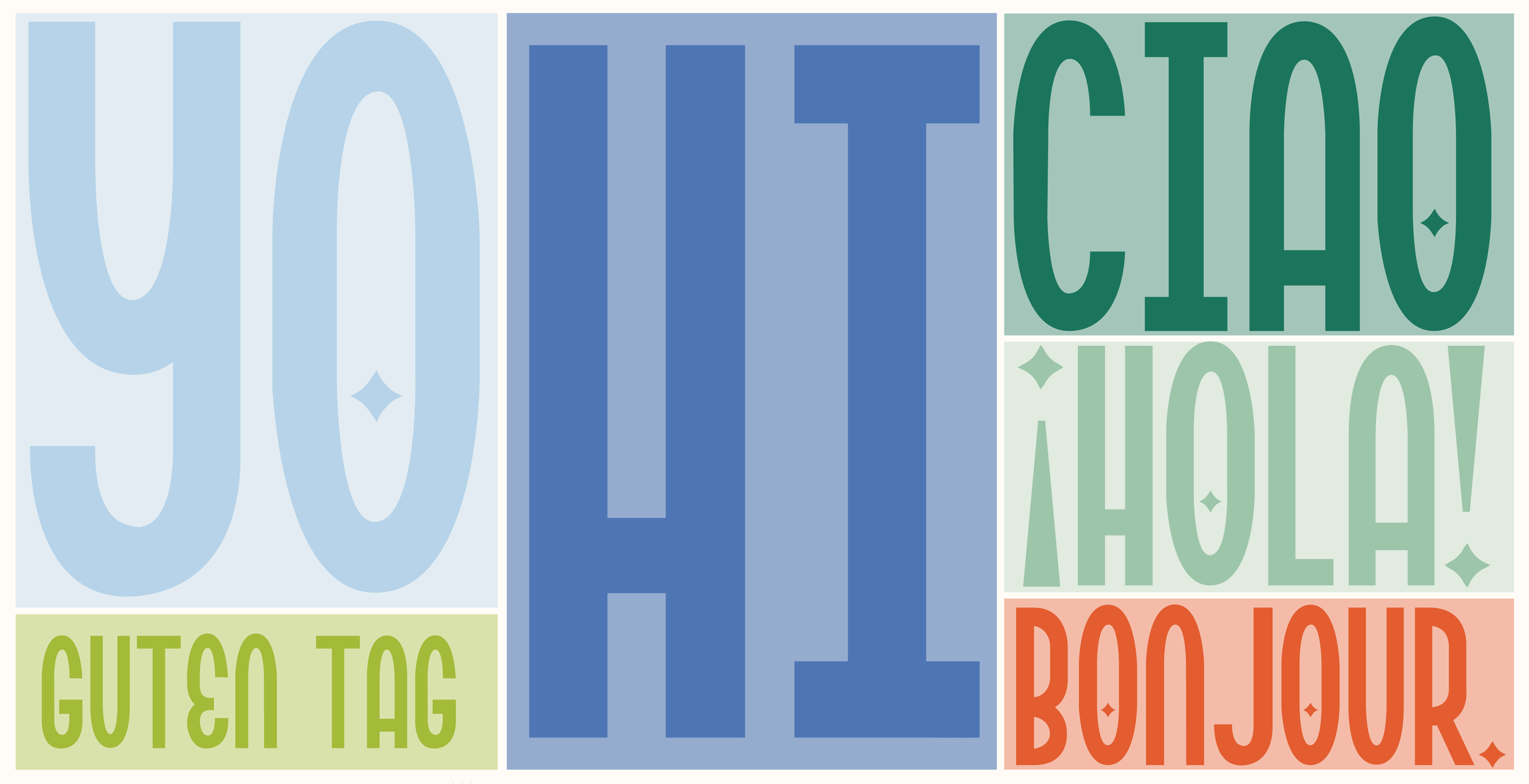
Camp Lucy is a celebration of child-like wonder and the pure joy of playfulness. Every aspect of this font is designed to evoke a sense of fun and creativity, reminiscent of carefree days spent exploring the great outdoors and embracing the magic of imagination. The goal is to create a whimsical experience that invites users to unleash their inner child.
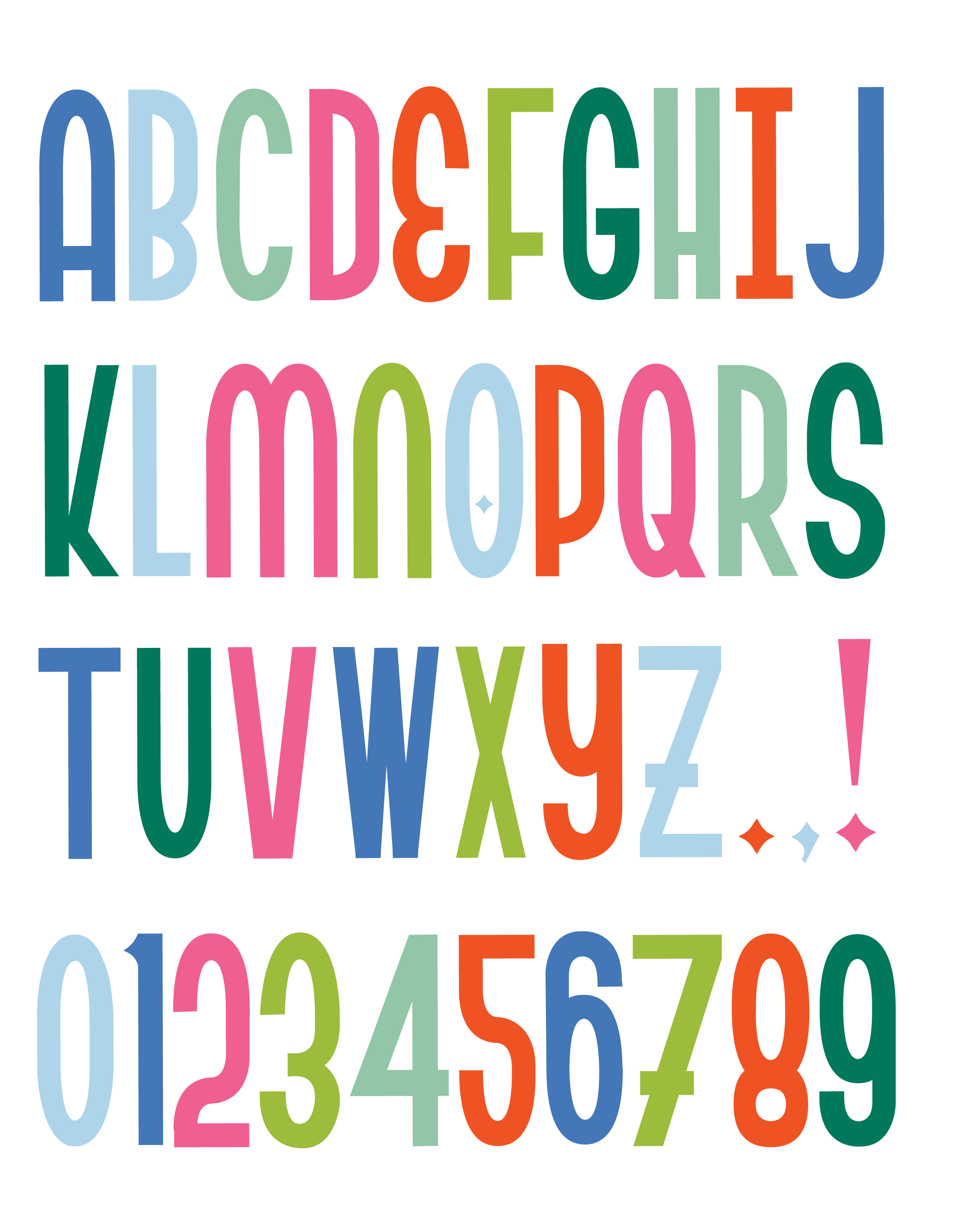
This font encompasses the full range of capital letters from A to Z in the Latin alphabet, along with the numbers 0 to 9. It also includes essential punctuation marks such as the period, comma, and exclamation point, allowing for versatile expression in a variety of contexts.
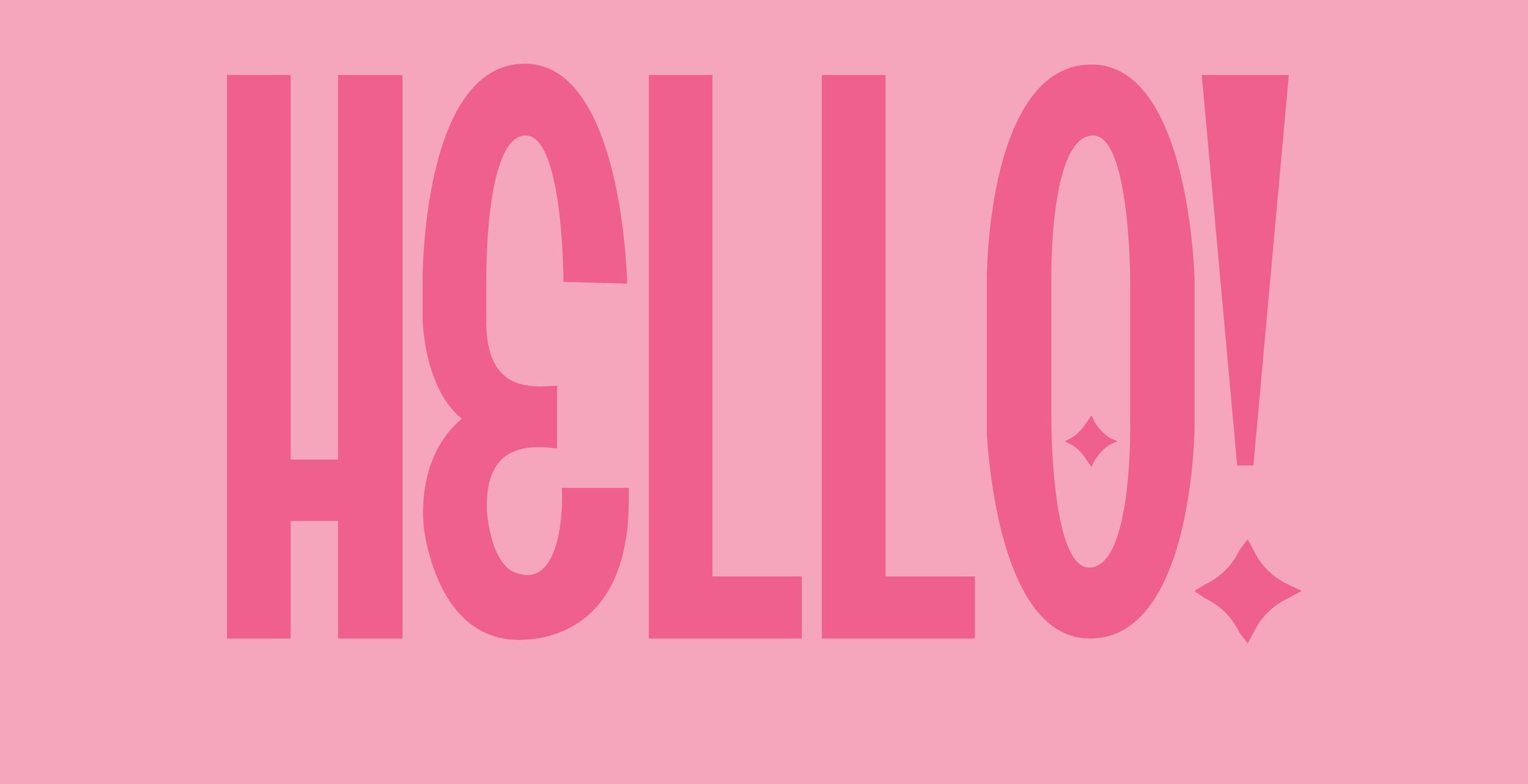
One of the most distinctive characteristics of the Camp Lucy font is its low-waisted design, which gives it a unique, approachable feel. The narrow profile enhances its playful nature, while the gentle curves add a touch of warmth and friendliness. This combination creates a font that feels both inviting and energetic, perfect for projects that aim to inspire creativity and joy.
CAMP BRANDING
𖡼𖤣𖥧𖡼𓋼𖤣𖥧𓋼𓍊
CAMP BRANDING 𖡼𖤣𖥧𖡼𓋼𖤣𖥧𓋼𓍊


COOKBOOK
𓊤
COOKBOOK 𓊤
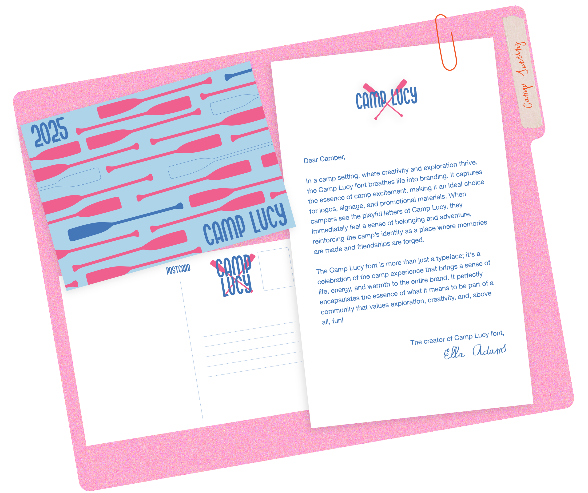
Camp Lucy font was originally designed to be used in camp branding. Inspired by my summer I served at a summer camp and fell in love with the aesthetic of camp. I have always loved kiddos and their sense of wonder. I wanted to capture this child-like-wonder into a font that could be used as a sense of adventure.

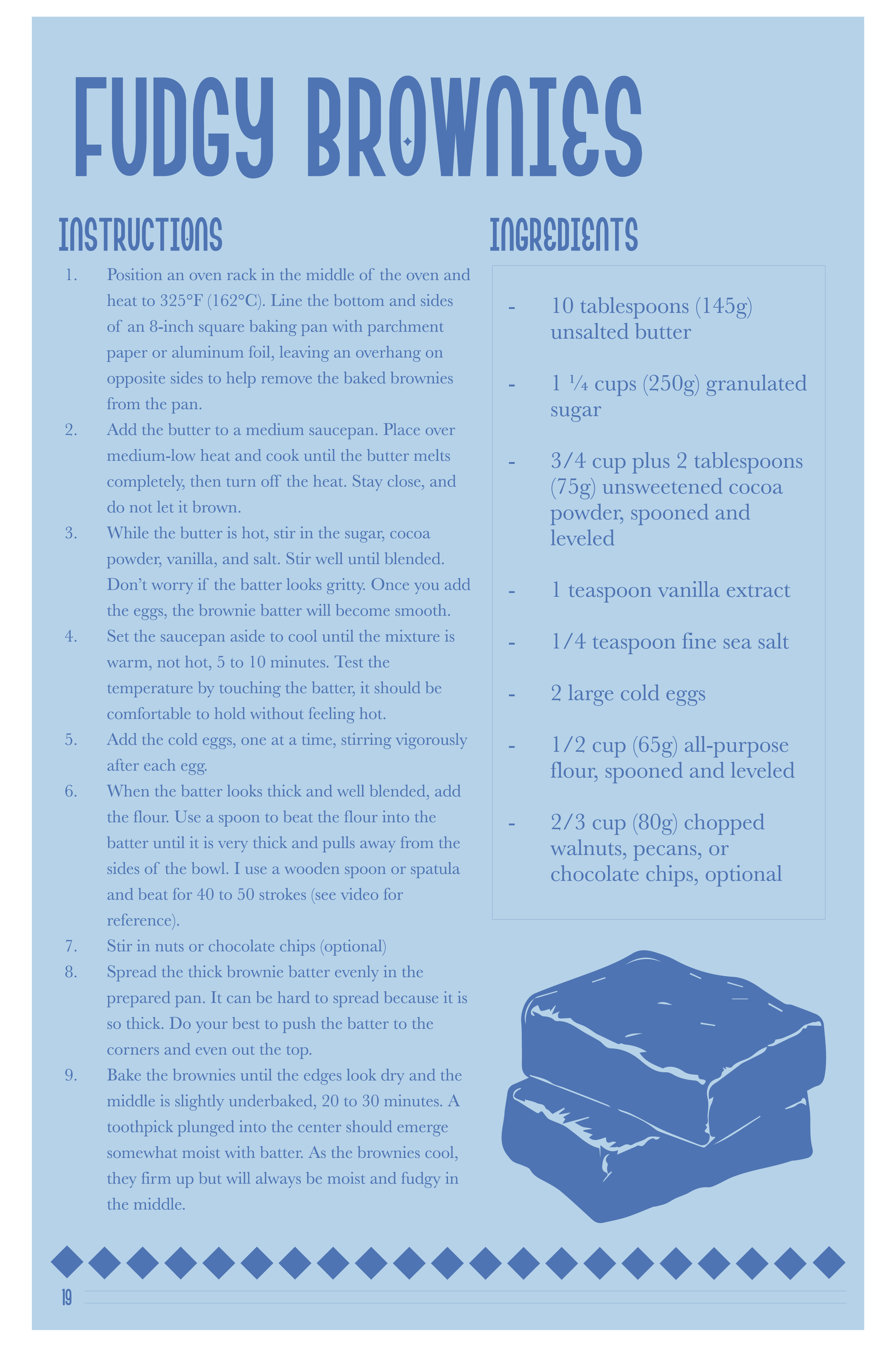
The Camp Lucy font is an excellent choice for a cookbook, as it encapsulates the warmth and joy of home-cooked meals and shared culinary adventures. Its playful and whimsical design adds a sense of fun, making the cooking experience feel approachable and inviting, particularly for families and novice cooks. Addistionally, its joyful character resonates with the idea of gathering around the table with loved ones, greating a sense of community and celebration that aligns perfectly with the spirit of cooking.
ICECREAM SHOP
⋆✴︎˚。⋆
ICECREAM SHOP ⋆✴︎˚。⋆
